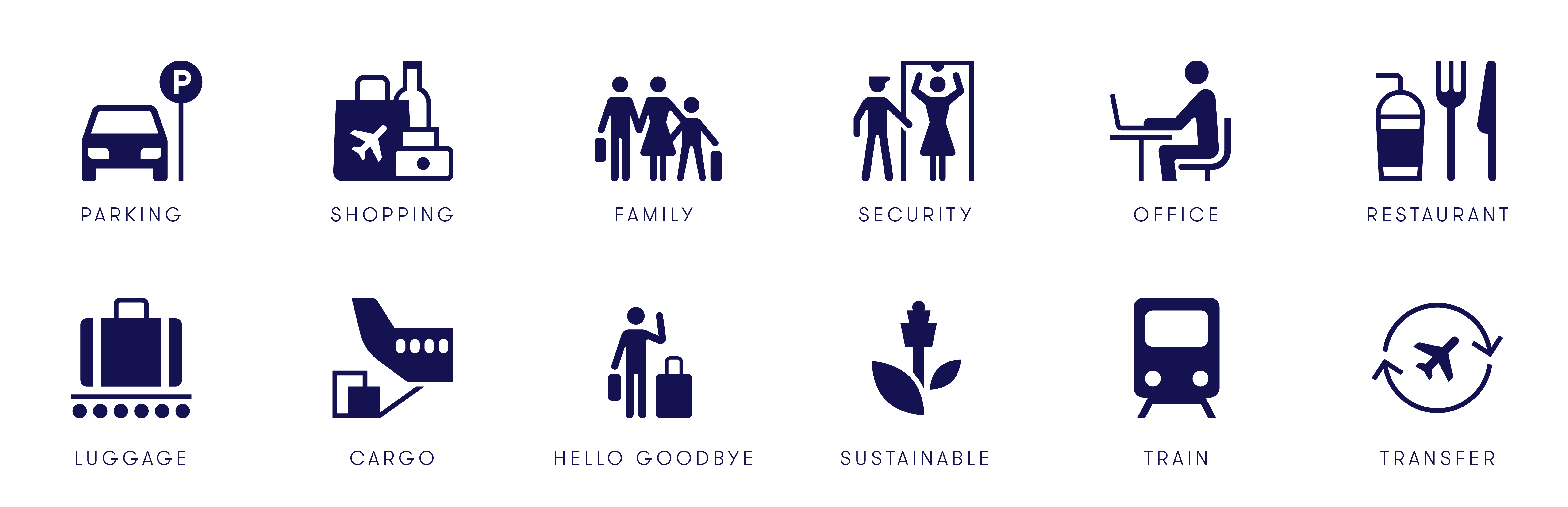


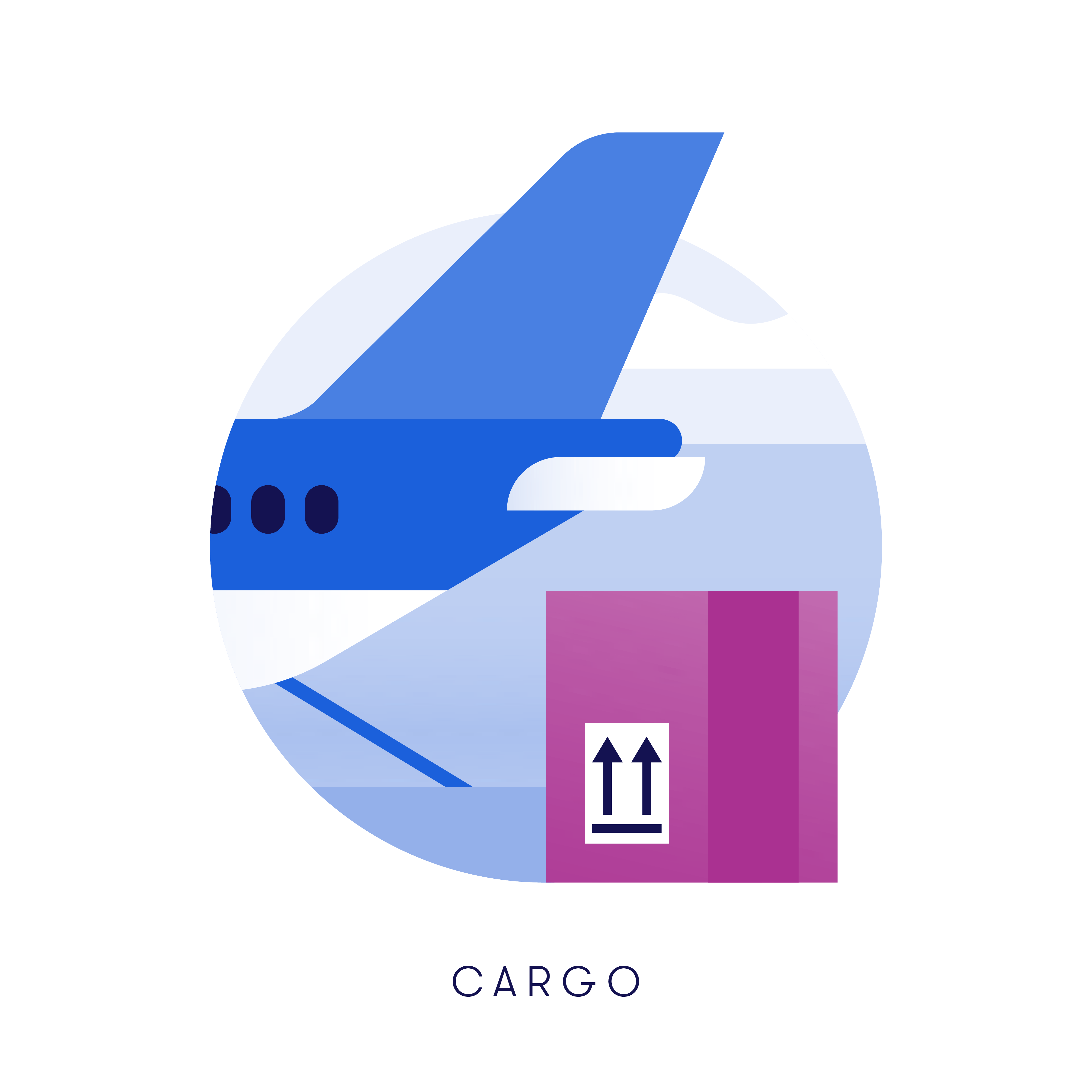


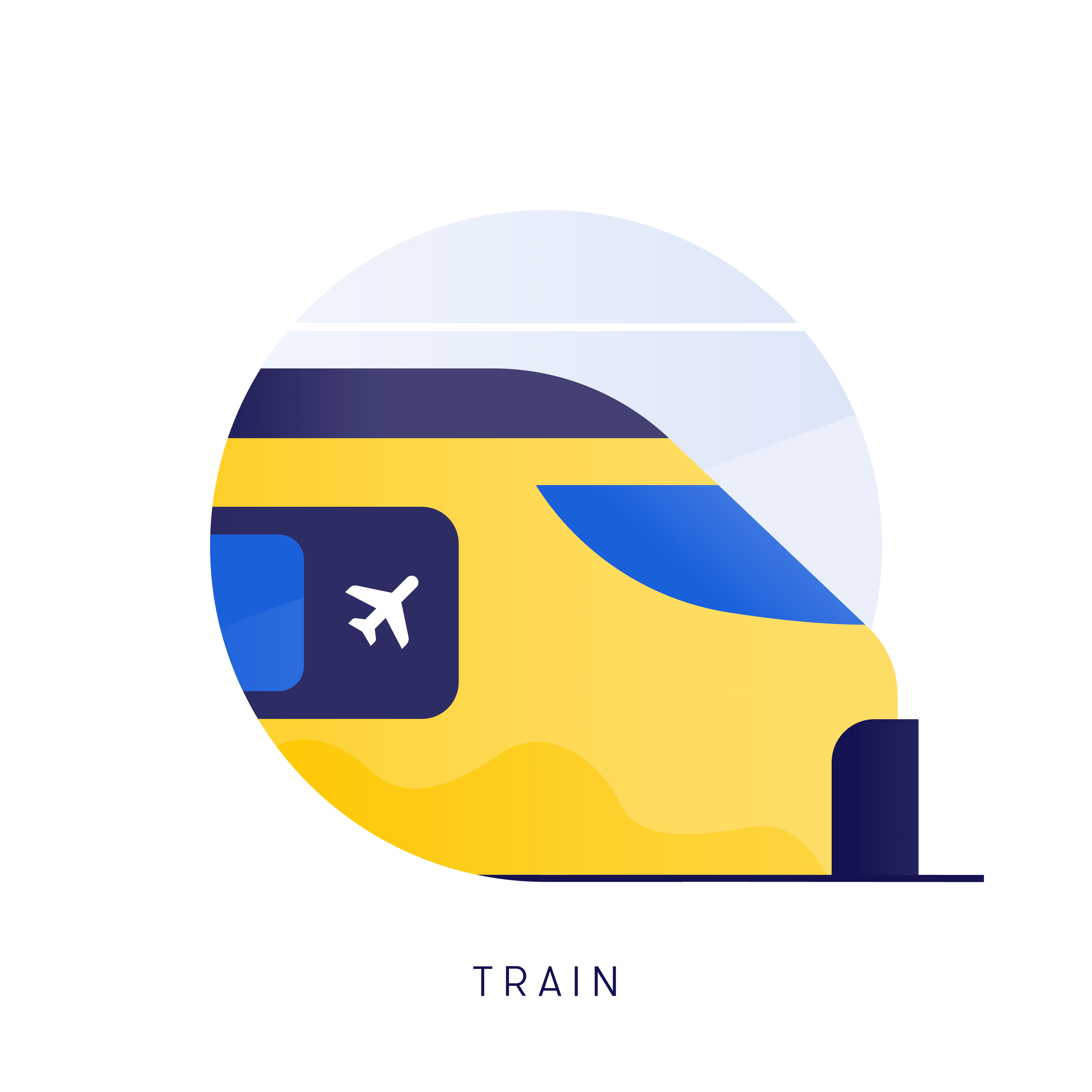


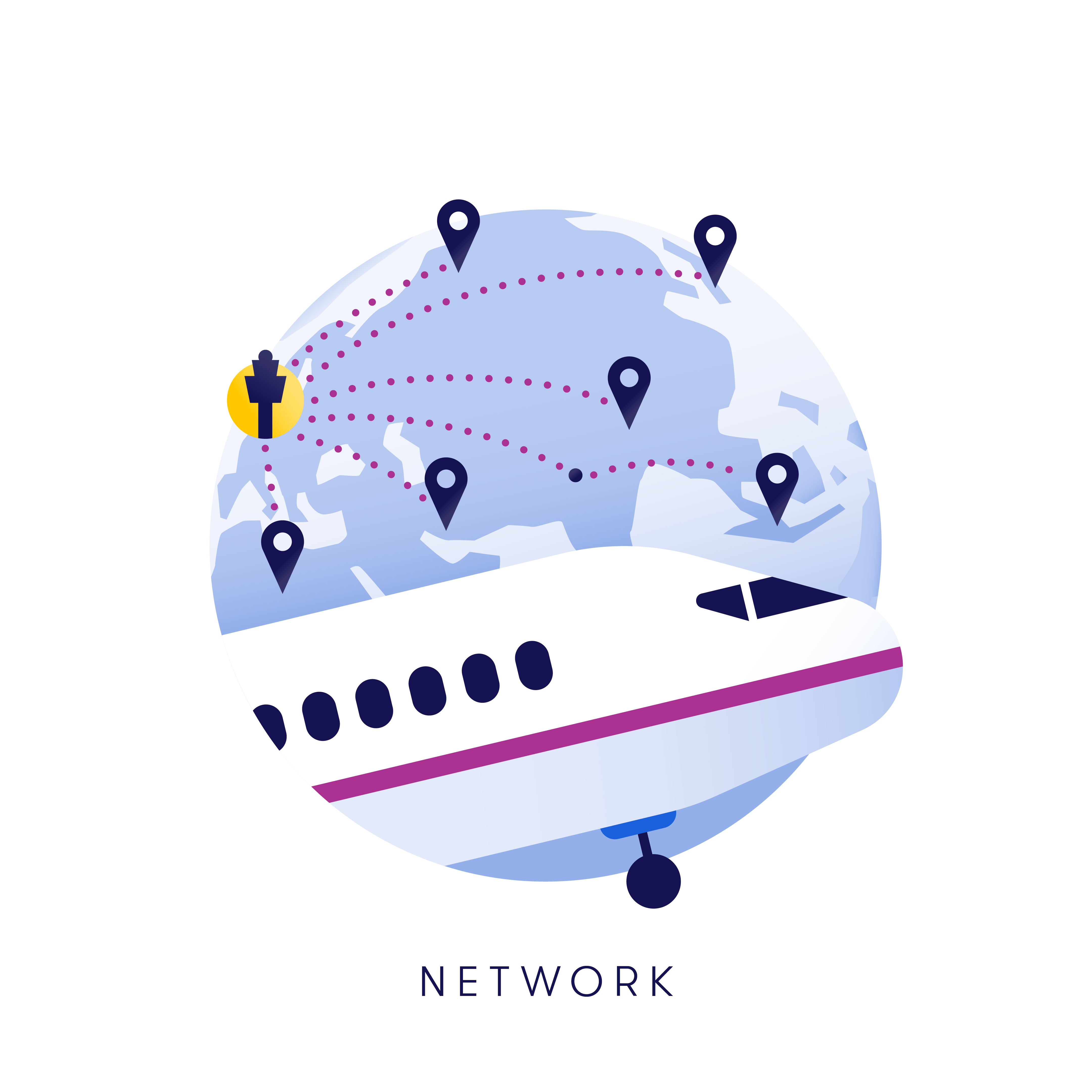
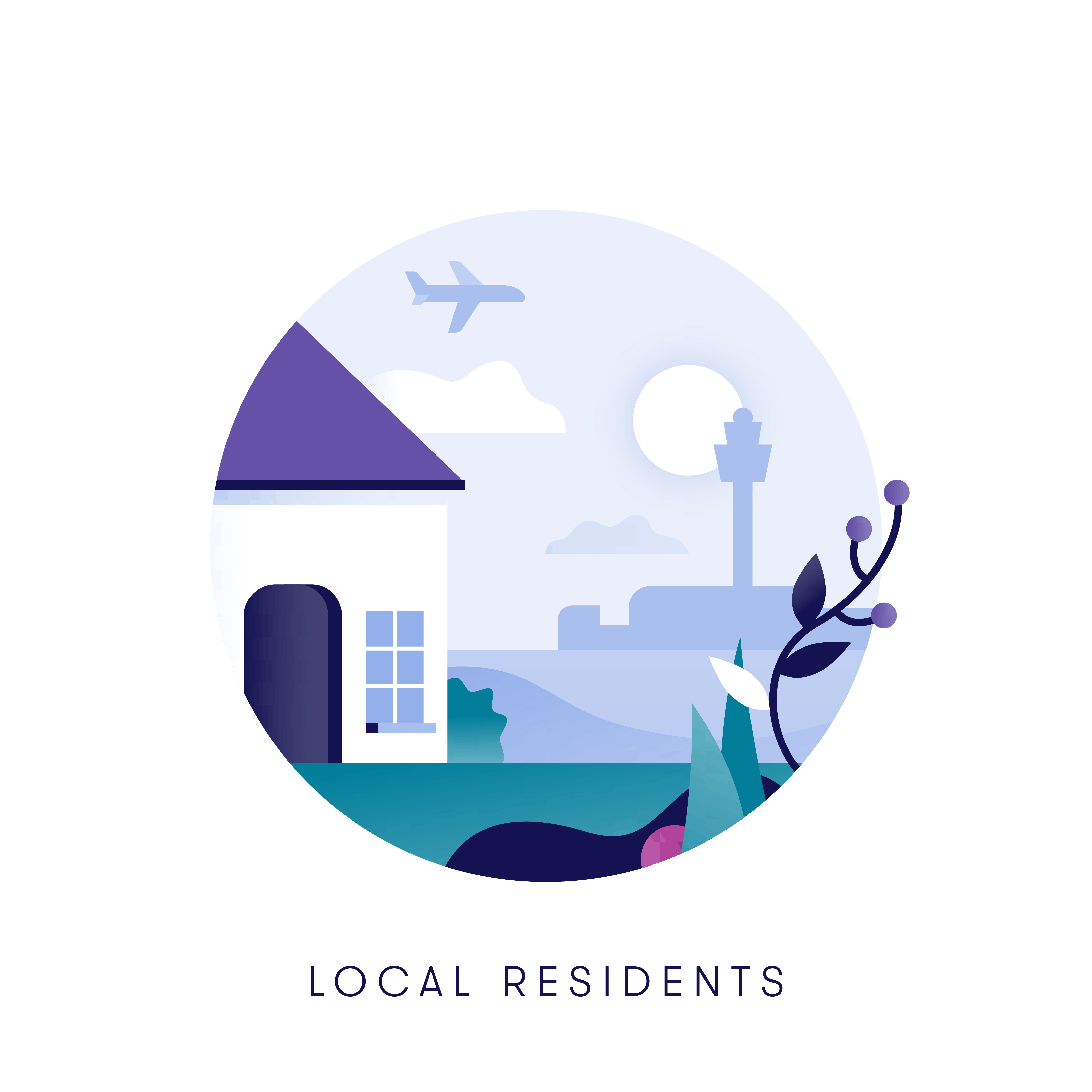


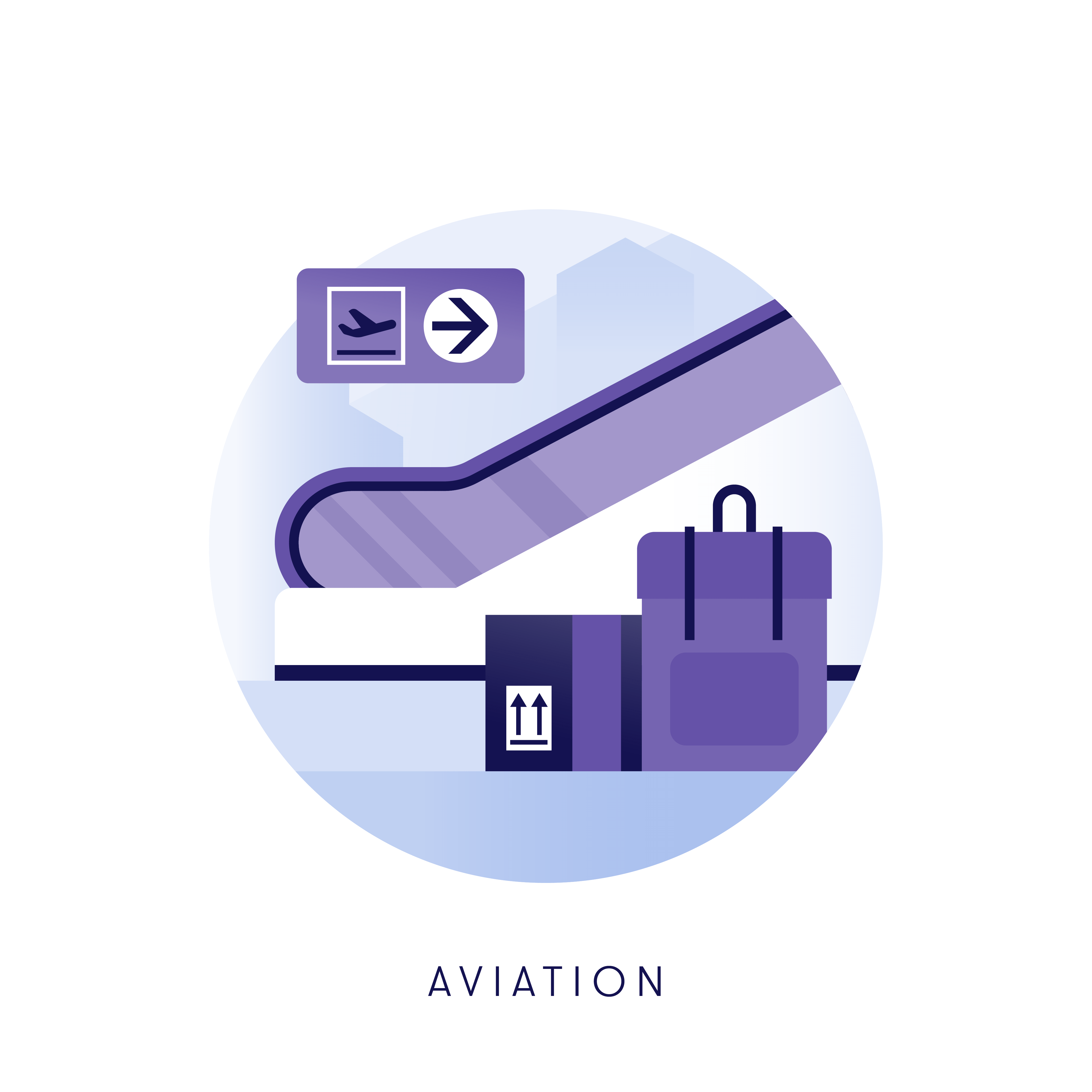
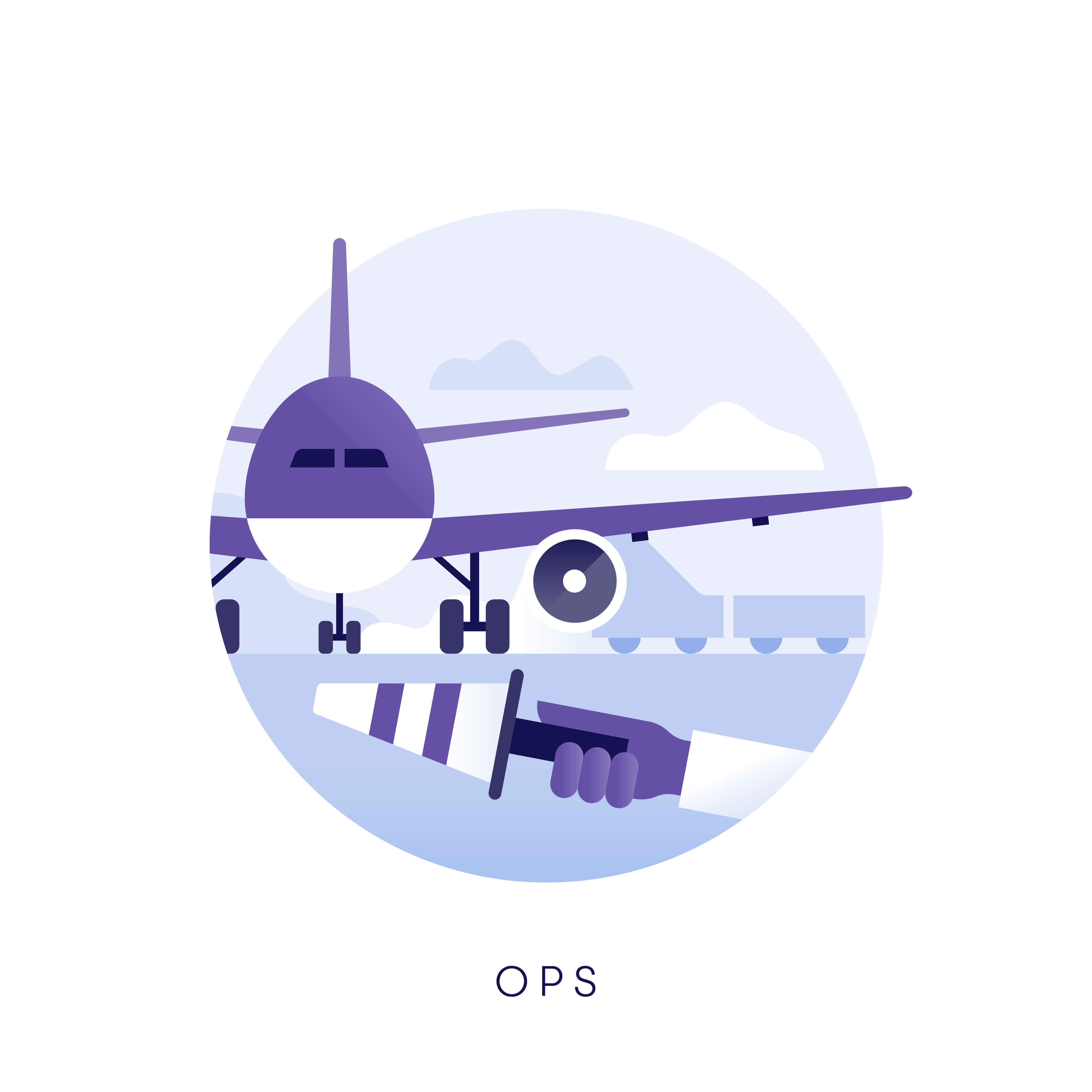
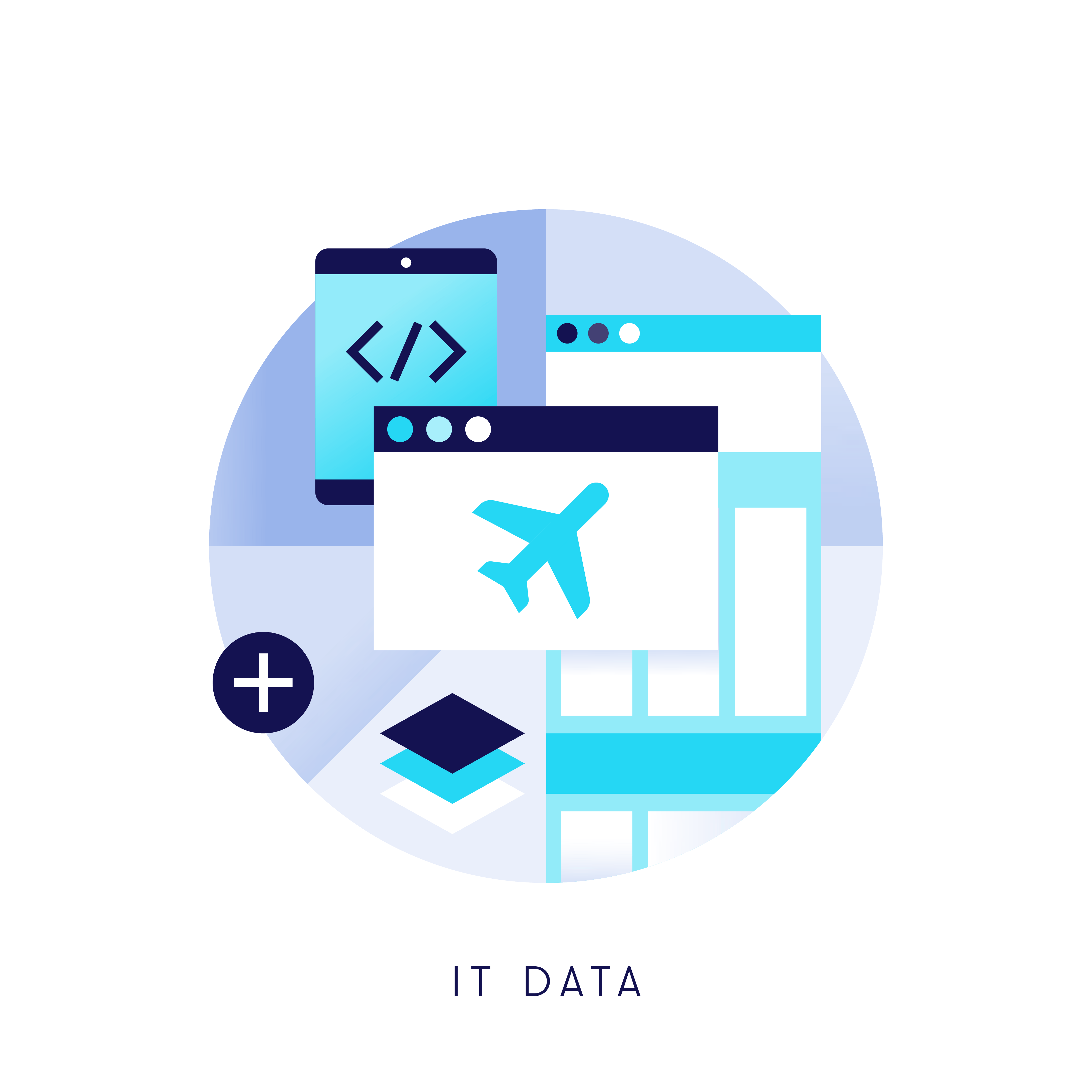
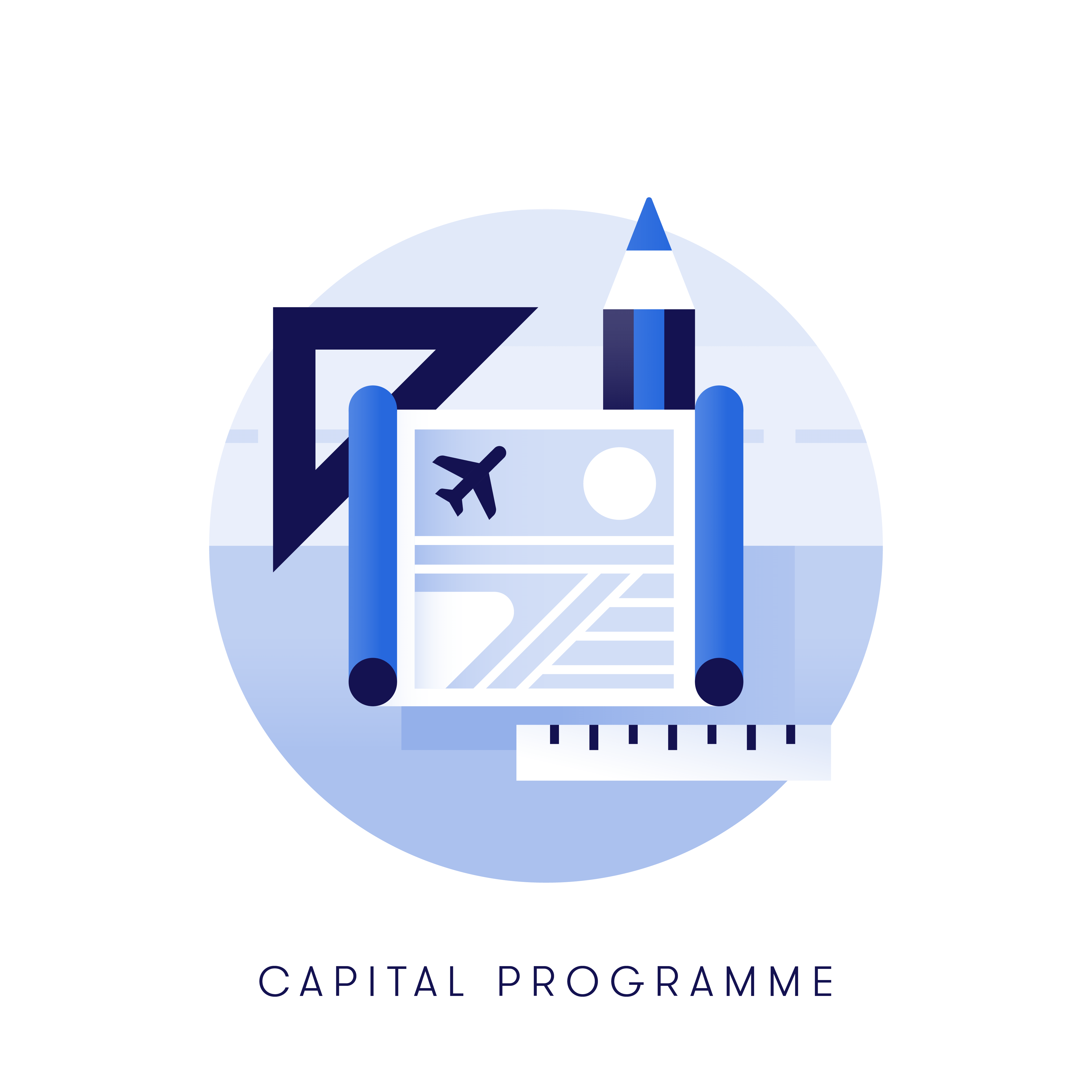
Here below are the special iconography for the ‘Matrix’ project.
Schiphol
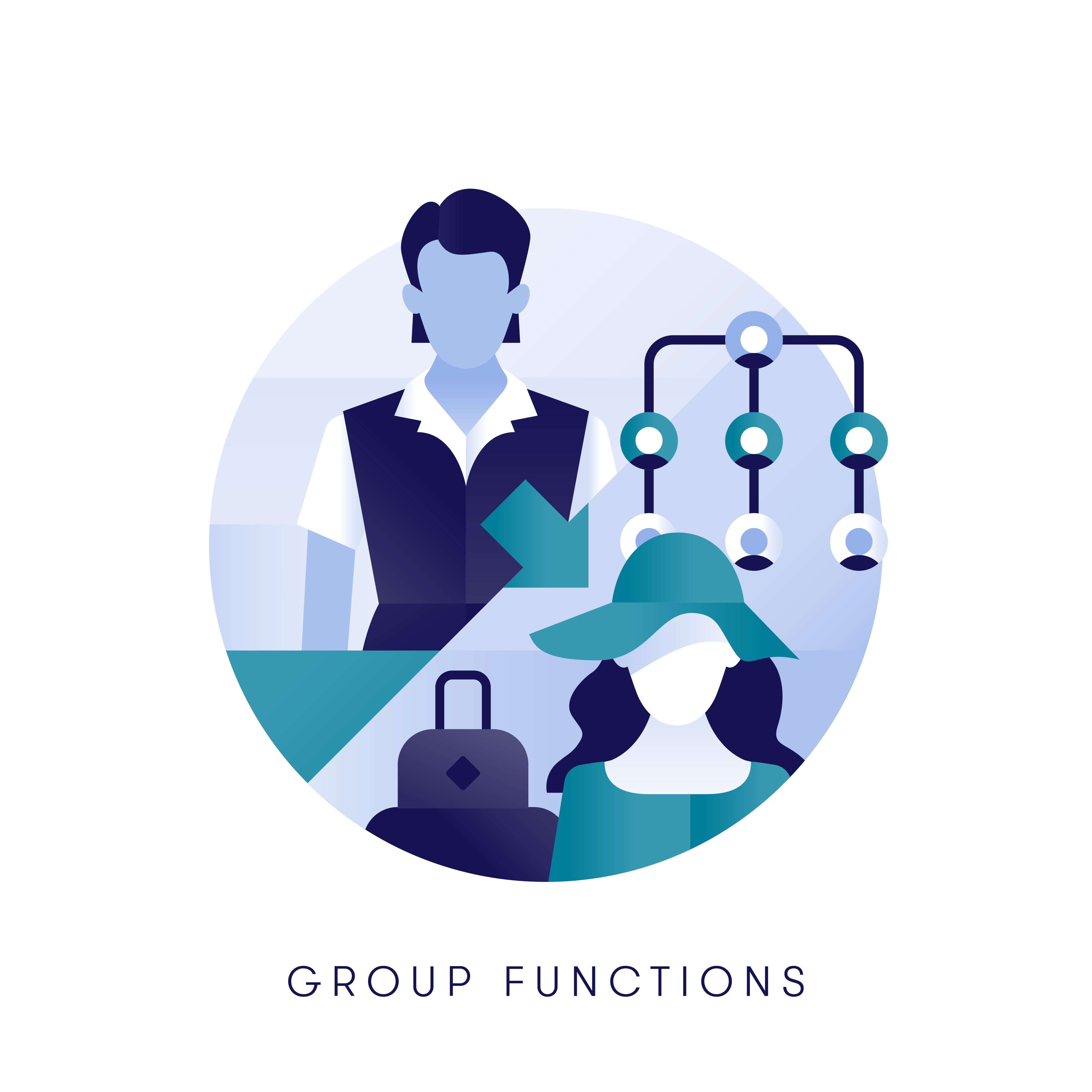
Corporate Branding Iconography
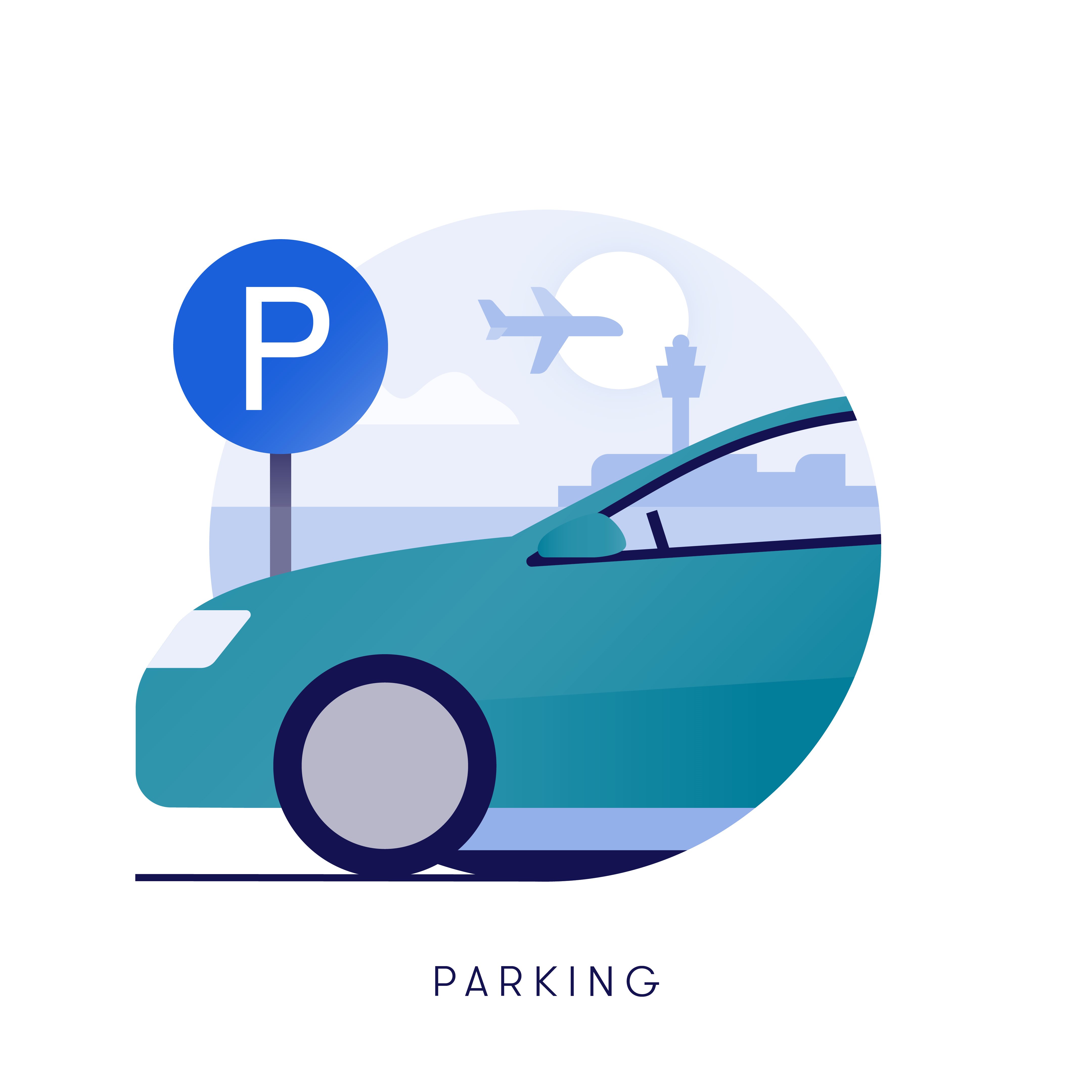
Few places in the world have as much diversity as an airport. People from all walks of life arrive and depart 24 hours a day, 7 days a week. With so many people speaking so many different languages you need more than textual language to communicate with them. You need crystal clear visual storytelling. That’s why Schiphol – the biggest airport in the Netherlands – asked multiple designers to participate in a pitch to design their new icons and illustrations. These icons and illustrations would be used on the Schiphol website and eventually in the airport itself.
Since winning the pitch I’ve been illustrating non stop! Creating the icons is an ongoing process but multiple illustrations and icons are already being used today. I had to work with creative constraints like the brand colours, accessibility, readability and cultural diversity. All while avoiding harsh straight angles and stroke outlines. The end results are mature and elegant icons and illustrations with a light and approachable color palette. By adding parts of the illustration that move outside of the round shapes I added a sense of movement. That’s what an airport is all about for most people. Movement.
Schiphol is a mature brand that tries to offer you a warm welcome and be as hospitable as possible. That’s why I added light gradients and playful shapes. Every icon tells a short story that needs to be understood by all visitors. That’s why each icon has a sober background to make the subject matter really stand out. With a subtle attention to detail I gave the icons something the travellers can relate to. No matter how long a traveler will stay in the airport I hope these icons will not only help them find their way around the airport but also help them feel welcome and brighten their day.


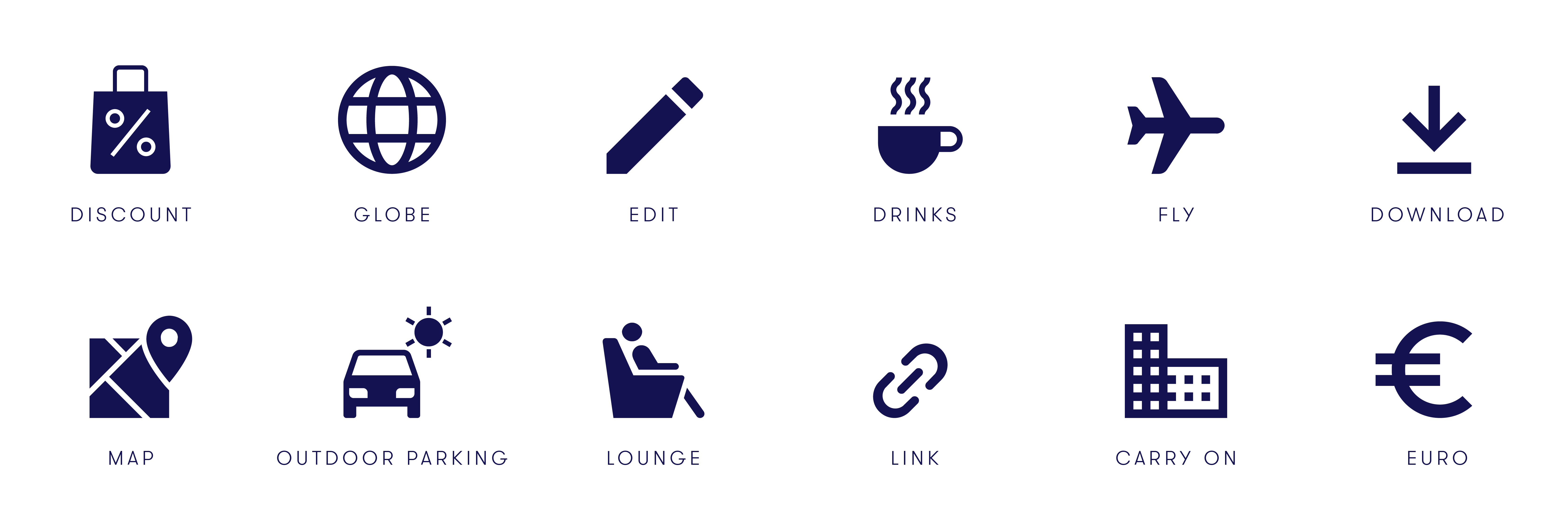
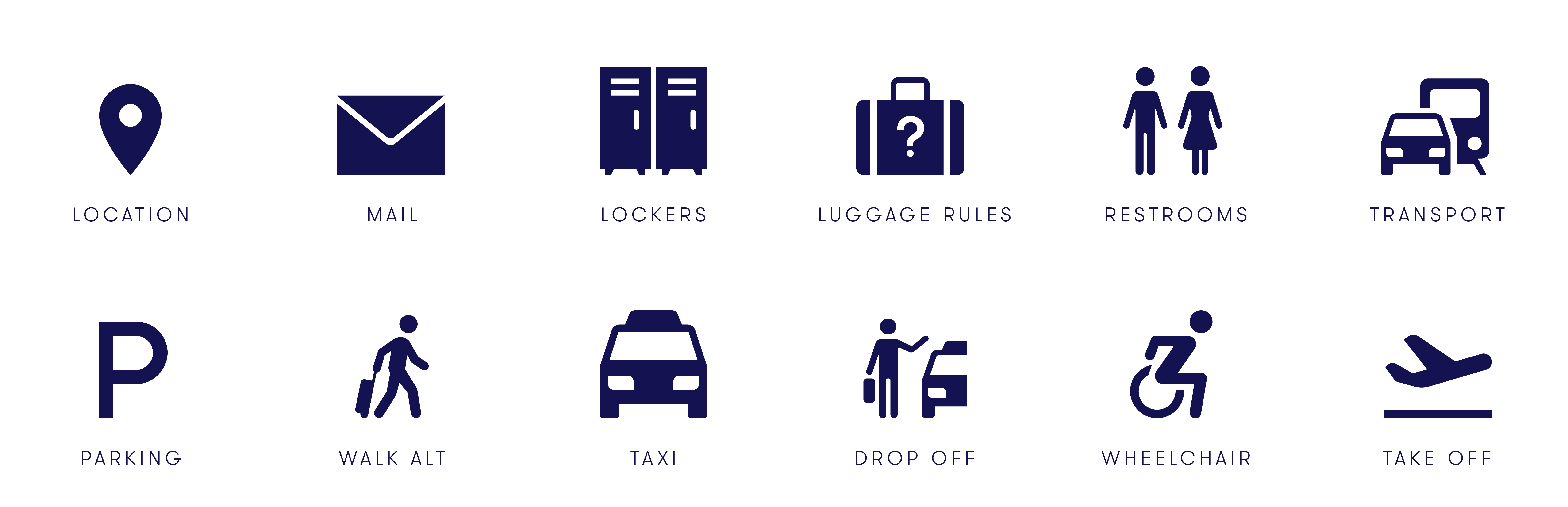
Here below are the small digital iconography for the Schiphol online.